New clients, unlock 10% off all plans 🔥 at checkout with code: CEO10SPECIAL (Limited Time Offer)
New clients, unlock 10% off all plans 🔥 at checkout with code: CEO10SPECIAL (Limited Time Offer)


If job search could even be a journey, a stellar professional resume writing is your gateway!
The key principles of writing a professional resume have remained unchanged over time, but advancement in technology mean more aspects of the application and hiring processes happen online than ever before.To keep up to current best practices, you’re better ready to tailor your resume in a way that beats these hiring technologies which includes the application tracking systems.
Personnel who peruses resumes such as recruiters and hiring managers, will tell you about 10 to 15 seconds is typically spent on deciding whether a resume is worth the read or not.
If nothing impressive is captured within that window period, the resume is trashed without a second glance.
Below are standard guidelines outlined to make a succinct and organized resume that helps readers immediately spot out a candidate that is worth their time!

Generally, a professional resume should pattern this way:
You may note quickly that for recent graduates, it is appropriate to put Education immediately after the objective or summary, followed by past employment/internships and relevant coursework.
A general rule of thumb is to maintain your resume in one or two pages. However, the actual length depends on the amount of relevant information you’ve got to offer.
A one-page resume will suffice if you have been in the workforce for less than 5 years.
Only in certain special cases should your resume be any more than two full pages especially within the US, Canadian and Australian job markets.
Furthermore, ensure to maintain your work listings to go not more than 10 to 15 years, except earlier experience play relevant to your targeted position.
If a second page is required, ensure there is enough content to fill a minimum of 1/4 of the second page.
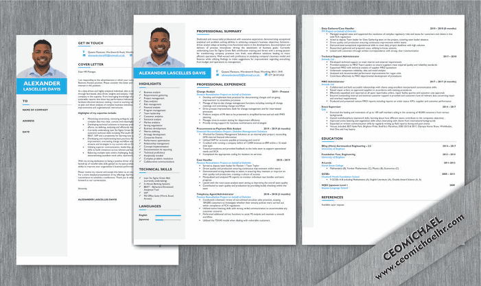
To boost your chances of landing an interview, carefully select a visually attractive and well organized resume format incorporating effects such as bold or italics, text centering’s, or indentations for emphasis.
Keep it succinct and consistent. For example, if one heading is bold, every other heading should be bold.
When you’re perusing a prospective employer’s website , you’ll get an honest idea of how traditional or contemporary the company culture is.
Ensure to use a high-quality paper choice of bright white.
Within the past years, the quality was cream or light gray stationery, but bright white seem to be a better choice as the resume may be scanned, faxed, or copied.
A simple graphical touch can facilitate the visual appearance of your resume.
It project your documents and make it stand out visually from your competitors on the interviewer’s desk.
A graphic may be seen as too informal if the industry or the organization you’re applying to is extremely traditional.
Also, note that graphics might not work ideally in faxed or emailed resumes. However, in a printed resume, they will be very effective.
Good font choices for resume include time-tested typefaces like Times New Roman, Arial, or Georgia.
Other great choices include Gill Sans MT, Tahoma, Trebuchet, and Verdana. Even Courier New, which offers a standard “typewriter” look could also be appropriate.
The recommended type size on a resume can usually be from 10 to 12 points.
Key points to remember when selecting resume margins are:
Adequate “white space” on all four sides to make a clean and readable look.
Space for the interviewer to form notes on the page.
Sending a visually appealing resume with grammatical errors in it is like getting to an interview with spinach on your teeth.
So please, grammar check, proofread, and allow other people proofread your resume before you send it out.
Related Reading: Bad Resume Examples
Share
Further Reading
*The names and logos of the companies referred to in this page are all trademarks of their respective holders. Unless specifically stated otherwise, such references are not intended to imply any affiliation or association with CEOMichaelHR.
Land interviews 3x faster while submitting fewer resumes
Copyright © 2026, ceomichaelhr.com.
All rights reserved.
Land interviews 3x faster while submitting fewer resumes
Copyright © 2026, ceomichaelhr.com.
All rights reserved.

Learn the same techniques our expert resume writers have used to get thousands of clients closer to their next job
Unlock expert resume tips, start landing multiple interviews!

Stay connected to receive powerful career insights, updates, and inspiration that’ll help you hit your career goals.